
How to Match Your Invitations to Your Utah Wedding Venue
Your wedding invitation does more than share information. It sets the tone for your entire celebration, and when it matches your venue's aesthetic, everything feels intentional. That cohesion isn't about being matchy-matchy—it's about creating an experience where every detail supports the others.
Here's the thing: a garden estate calls for different invitations than an industrial loft. Mountain resort elegance needs a different approach than farmhouse charm. And getting that pairing right isn't about following rigid rules—it's about understanding what makes your venue special and translating that into invitation design.
Why Matching Your Invitation to Your Venue Actually Matters
When your invitation reflects your venue's vibe, you're doing two things. First, you're setting accurate expectations. Guests get a sense of the formality, the style, the feeling of your wedding before they even RSVP. Second, you're building confidence in your own choices. When the pieces fit together, you feel it—and that confidence shows up in how you approach every other wedding decision.
This isn't about impressing anyone. It's about creating a celebration that feels like you from start to finish. Your venue is one of your biggest design decisions, and your invitation is the first one guests experience. Making them work together just makes sense.
The Framework: Breaking Down Venue Types and Invitation Styles
Let's look at the major venue categories you'll find across Utah and what invitation elements complement each one. This isn't prescriptive—it's a starting point for finding your own style within each category.
Garden and Outdoor Venues
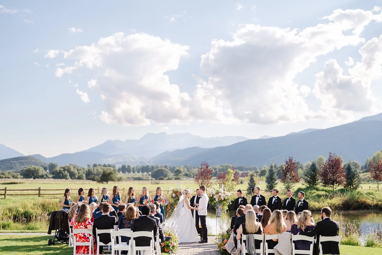
The Venue Vibe: Natural beauty, manicured or wild landscapes, ceremony sites surrounded by greenery or blooms. Think Red Butte Garden, Thanksgiving Point, botanical gardens, estate gardens, outdoor pavilions with mountain views.
What Makes Them Special: These venues let nature do the heavy lifting on beauty. The setting changes with seasons, and there's an organic quality that feels both romantic and relaxed, even when the celebration is formal.
Invitation Elements That Work:
Colors: Soft, nature-inspired palettes shine here. Think sage green with cream, blush with soft gold, lavender with warm gray, or dusty blue with taupe. Avoid anything too stark or industrial—you want colors that could exist in a garden.
Materials: Smooth cardstock works for polished garden venues, while textured papers (linen, cotton, or handmade) suit more organic outdoor settings. Vellum overlays add romance without weight. Deckled or hand-torn edges bring that natural, organic feel.
Design Style: Botanical illustrations work beautifully if executed with sophistication—watercolor florals, pressed flower details, or delicate line drawings of leaves and branches. Typography should balance romantic and readable. Flowing calligraphy paired with clean serif fonts creates that garden elegance.
What to Avoid: Heavy, dark designs that feel too formal or industrial. Overly geometric patterns. Anything that feels rigid or stark—garden venues call for softer, more organic design choices.
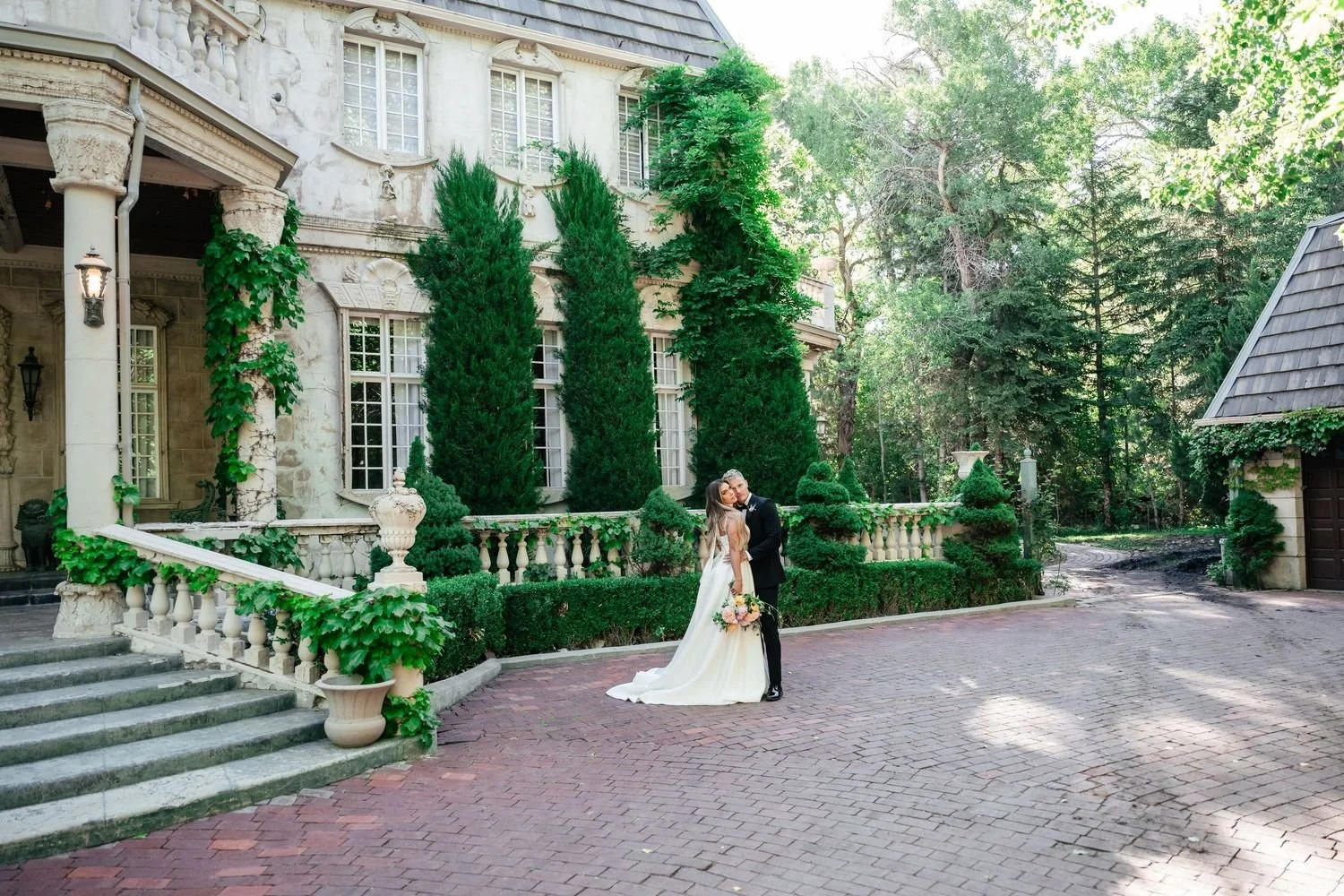
La Caille Wedding Venue
Our Recommended Semi-Custom Suite:
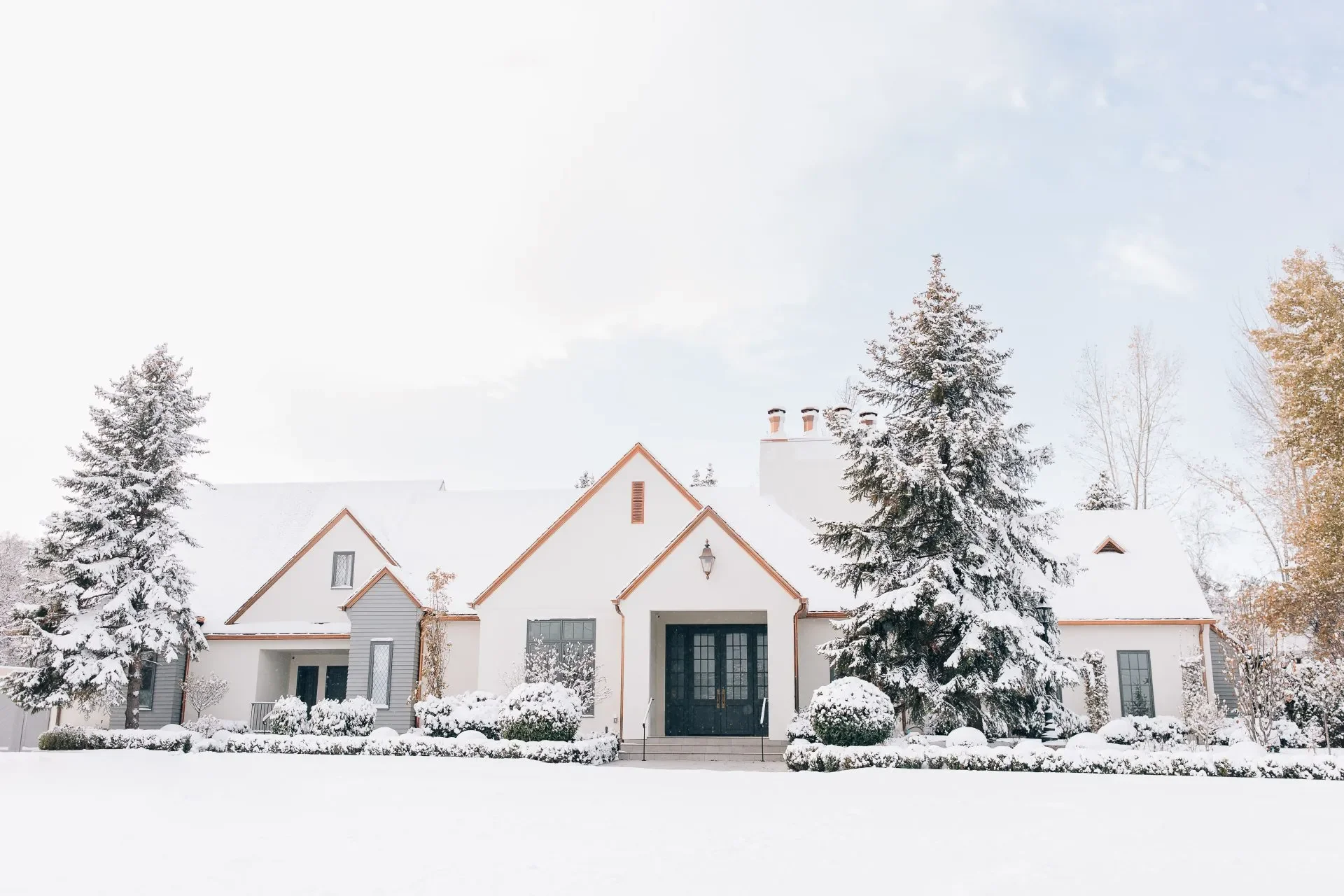
Mountain and Alpine Venues
The Venue Vibe: Elevated settings with mountain backdrops, whether that's canyon venues, ski resorts, or mountain lodges. Examples include Park City resorts, Sundance, Snowbird, Millcreek Canyon venues, or any ceremony site with peak views.
What Makes Them Special: These venues bring drama through landscape. You get epic views, natural grandeur, and that distinctive Utah mountain quality. They can range from rustic mountain charm to five-star resort sophistication.
Invitation Elements That Work:
Colors: Mountain palettes need depth. Dusty blue and cream, charcoal with sage, forest green with warm taupe, or burgundy with gold all work. For resort venues, add sophistication with metallic accents—copper, bronze, or silver depending on your overall palette.
Materials: Premium cardstock with subtle texture (linen or felt finish) feels appropriate for mountain luxury. Smooth, heavy cardstock works for polished resort venues. Wood veneer accents can work for rustic mountain settings if executed tastefully. Consider adding warmth through wax seals in deep, rich colors.
Design Style: Clean, sophisticated typography with subtle mountain references works better than obvious mountain themes. Think geometric line drawings of peaks, simple pine branch illustrations, or abstract mountain patterns. For rustic mountain venues, you can lean slightly more organic. For resort venues, keep it refined and elevated.
What to Avoid: Cartoon mountain graphics or overly literal pine tree patterns. Anything too casual for upscale mountain venues. For rustic venues, avoid designs so polished they feel corporate.
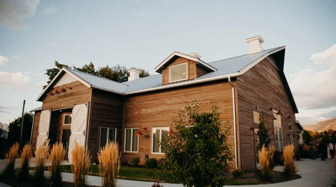
Riverbottoms Ranch Wedding Venue
Our Recommended Semi-Custom Suite:
Industrial and Urban Venues
The Venue Vibe: Exposed brick, concrete, steel beams, warehouse spaces converted to event venues, urban lofts, downtown buildings with character. Think The Laurel in SLC, The Startup Building in Provo, or any industrial-chic space.
What Makes Them Special: These venues bring edge and urban sophistication. The raw, unfinished elements create a blank canvas that works for various styles—from moody and dramatic to bright and contemporary.
Invitation Elements That Work:
Colors: Bold, confident palettes work here. Black and white with metallic accents (copper or silver), charcoal with terracotta, or even all-black invitations with white or gold ink. These venues can handle more dramatic color choices than traditional spaces.
Materials: Smooth, modern cardstock is your friend. Consider unique materials like acrylics or heavy vellum for impact. Clean, substantial paper stock that feels contemporary works beautifully. Avoid anything too soft or romantic in texture.
Design Style: Geometric shapes, bold typography, and clean lines suit industrial spaces. Sans-serif fonts feel natural here, though you can pair them with modern calligraphy for contrast. Keep the design intentional and confident. Negative space is your friend—don't overcrowd the design.
What to Avoid: Overly traditional or romantic designs with lots of florals and flowing scripts. Soft, pastel color palettes. Delicate, lightweight papers—industrial venues call for substantial materials and bold choices.

The White Shanty Wedding Venue
Our Recommended Semi-Custom Suite:

Get the best of both worlds: easy Canva customization with a professional designer's review!
The Kenzie suite is an elegant boho wedding invitation featuring a minimalist design with customizable colors—available as a Canva template with FREE professional designer review.
5x7 size
Historic Estates and Formal Venues
The Venue Vibe: Grand ballrooms, historic buildings, château-style venues, formal estates with architectural details. Examples include La Caille, Riverwoods Conference Center, Lion House, or any venue with traditional elegance.
What Makes Them Special: These venues bring established elegance and timeless architecture. They have formal presence and often feature crystal chandeliers, detailed millwork, or European-inspired design elements.
Invitation Elements That Work:
Colors: Classic, sophisticated palettes work best. Navy and gold, burgundy with cream, champagne with rose gold, or ivory with sage. These venues call for colors that will look timeless in photos years from now.
Materials: Premium smooth cardstock with a luxe finish is essential. Letterpress printing adds dimension and tradition. Engraving works for ultra-formal celebrations. The paper should feel substantial and expensive in hand.
Design Style: Traditional elegance executed beautifully. Formal script fonts for names, classic serif fonts for details, and refined layouts. Symmetrical designs often work better than asymmetrical here. Consider adding formal elements like monograms, classic borders, or architectural details that reference the venue.
What to Avoid: Overly trendy or modern designs that will date quickly. Casual fonts or layouts. Anything too minimalist—these venues call for design with presence and detail.
Twenty and Creek Wedding Venue
Our Recommended Semi-Custom Suite:
Modern and Contemporary Venues
The Venue Vibe: Clean lines, floor-to-ceiling windows, contemporary architecture, sleek design. Think newer event spaces with modern aesthetics, glass pavilions, or venues with minimalist interiors.
What Makes Them Special: These venues feel current and fresh. They photograph with that editorial quality everyone wants, and their clean aesthetic works as a backdrop for your personal style choices.
Invitation Elements That Work:
Colors: Contemporary venues can handle bold choices or sophisticated neutrals. Charcoal and sage, warm gray with copper, cream with forest green, or even unexpected combinations like terracotta and navy. The key is choosing colors with intention.
Materials: Smooth, high-quality cardstock is essential. Consider modern materials like acrylics for a statement, or vellum overlays for dimension. The finish should be clean—no heavy textures that feel traditional.
Design Style: Clean typography is king here. Modern calligraphy works beautifully, or go fully contemporary with sophisticated sans-serif fonts. Geometric elements, negative space, and intentional layouts create that modern feel. Simple line art can work if executed with sophistication.
What to Avoid: Overly traditional scripts or ornate details. Heavy, textured papers that feel old-fashioned. Designs that try to compete with the venue's sleek aesthetic rather than complement it.
River Bridge Wedding Venue
Our Recommended Semi-Custom Suite:
Rustic Farmhouse and Barn Venues
The Venue Vibe: Renovated barns, farmhouse settings, pastoral venues with wooden beams and string lights. Examples include Wadley Farms, Wheeler Farm, Noah's Event Venue, or any venue with that polished-rustic aesthetic.
What Makes Them Special: These venues balance casual warmth with elegant execution. They're approachable and comfortable while still photographing beautifully. The rustic elements bring character without feeling unfinished.
Invitation Elements That Work:
Colors: Warm, organic palettes work beautifully. Navy and gold, dusty blue with terracotta, sage with cream, or warm gray with copper. Avoid anything too bright or stark—these venues call for colors with warmth.
Materials: Textured cardstock brings appropriate warmth—linen or cotton finishes work well. Kraft paper accents can work when paired with quality printing (letterpress elevates kraft paper beautifully). Consider natural elements like twine or linen ribbon, but keep execution polished.
Design Style: Modern fonts with organic touches create that rustic-refined balance. Hand-drawn botanical illustrations, simple branch motifs, or geometric patterns with organic elements all work. The key is pairing rustic touches with sophisticated typography and clean layouts.
What to Avoid: Overly casual designs that feel DIY rather than intentional. Too many rustic elements (wood grain + kraft paper + twine + burlap = overkill). Designs that lean so rustic they feel dated rather than timeless.
Beyond Venue Type: Other Factors That Influence Your Invitation Choice
Formality Level
Not all garden venues are casual, and not all ballrooms are black-tie. Your invitation should match the actual formality of your celebration, not just the venue category. A formal garden wedding at Thanksgiving Point needs more refined invitations than a casual backyard ceremony, even though both are outdoor venues.
Season and Timing
Summer garden weddings can embrace lighter, brighter palettes and delicate materials. Winter mountain celebrations call for richer colors and substantial cardstock. Fall barn weddings work beautifully with warm, organic tones. Let your season influence your color and material choices.
Indoor vs. Outdoor
Outdoor venues often work better with organic materials and softer design elements. Indoor venues, especially formal ones, can handle more structured designs and traditional elements. If your venue includes both (outdoor ceremony, indoor reception), consider which space feels more significant to your celebration.
Your Personal Style
This is the most important factor. If you love bold, modern design but chose a historic venue, you can still have contemporary invitations—just make sure they respect the venue's formality level. If you're naturally drawn to soft, romantic aesthetics but your venue is industrial, add warmth through color and organic touches while keeping the overall design clean.
Common Matching Mistakes (And How to Avoid Them)
Over-Themeing: Your invitation doesn't need to literally illustrate your venue. A mountain venue doesn't require mountain illustrations on every piece. A garden venue doesn't need flowers covering every surface. Subtle references work better than obvious ones.
Ignoring Formality: A black-tie ballroom wedding needs formal invitations, even if you personally prefer casual design. A backyard celebration needs relaxed invitations, even if you love traditional elegance. Match the formality level first, then inject your personality.
Choosing Trends Over Venue Fit: If the trendy design everyone's using doesn't match your venue, skip it. Your invitations should still look cohesive with your wedding in five years, not just Instagram-worthy today.
Forgetting Practical Elements: Your invitation needs to communicate essential information clearly, regardless of aesthetic. Don't sacrifice readability for style—even the most beautiful invitation fails if guests can't figure out when and where to show up.

Making It Personal While Staying Cohesive
The best invitation matches aren't about following formulas—they're about understanding your venue's character and translating it into design that still feels like you. Here's how to balance both:
Start with venue vibe, add your personality through color. If your venue suggests neutral elegance but you love rich jewel tones, use sophisticated burgundy or emerald instead of expected champagne.
Let typography reflect you. Love modern style but have a traditional venue? Use contemporary fonts in a classic layout. Prefer romantic vibes in an industrial space? Pair flowing calligraphy with clean, modern elements.
Choose one or two elements to personalize boldly. Maybe it's an unexpected color combination, or a unique material choice, or custom illustrations. Let one element be distinctly you while keeping others tied to the venue aesthetic.
Let's Match Your Invitations to Your Perfect Venue
Understanding how to match invitations to venues is one thing—actually creating that perfect pairing is another. Whether you've chosen a garden estate, mountain resort, industrial loft, or somewhere completely unique, we'll help you design invitations that complement your venue while feeling authentically you.
Ready to create invitations that set the perfect tone for your Utah wedding? Let's start designing.